Earlier this week I sent an email out to all pre order customers advising them of anticipated despatch dates of the new volume of A Stitch in Time volume 1. It seems a few people for one reason or another don't seem to be receiving their updates so I thought it wise to share the message here on the blog so that its easy to find:
"I'm delighted to be able to advise you that firm plans have now been made and are underway to enable us to commence despatch of A Stitch in Time volume 1.
All pre orders currently placed will be despatched between beginning and mid October of this year. We will despatch in the same order as orders were placed but we should have all pre orders despatched within a two week period so no one should be kept waiting too long. An individual email will be sent advising you that your book has been despatched. For those of you who have ordered the e-book you will receive the updated version in mid October.
The website and online shop have now been updated to reflect this change."
Orders placed for volume 1 up until 31st August will be despatched in this first wave, then orders placed after this date will be despatched by the end of October.
Please note that the pre order price of £30 will end on the 31st August and the book will then be on sale at its RRP of £35
If you would still like a copy of volume 1, you can order it here
for now
Susan xx

Saturday, August 02, 2014

Monday, July 14, 2014
A Talk at Toft
This weekend I will be travelling down to the Warwickshire to the fabulous Toft Alpaca stud farm, home of Toft Alpaca Yarns.

I have always wanted to have the opportunity to visit this beautiful Alpaca stud farm and I'm finally about to get the chance and you can join me. I will be giving a talk this Saturday, the 19th July about my life in hand knitting, how I got to this point, designing, creating my own books and yarns and what is happening next. In addition to the talk you get to go on a tour of the stud farm, which includes meeting the wonderful alpacas themselves, along with delicious refreshments.
The whole event only costs £25 per head. I'm delighted to hear that the event is all set to be very well attended but I believe there are a few extra seats available, so do go along to the Toft website to book your ticket if you would like to come along.
for now,
Ruby xx
I have always wanted to have the opportunity to visit this beautiful Alpaca stud farm and I'm finally about to get the chance and you can join me. I will be giving a talk this Saturday, the 19th July about my life in hand knitting, how I got to this point, designing, creating my own books and yarns and what is happening next. In addition to the talk you get to go on a tour of the stud farm, which includes meeting the wonderful alpacas themselves, along with delicious refreshments.
The whole event only costs £25 per head. I'm delighted to hear that the event is all set to be very well attended but I believe there are a few extra seats available, so do go along to the Toft website to book your ticket if you would like to come along.
for now,
Ruby xx
Friday, July 04, 2014
Sample Knitters and the Vintage Shetland Project
 |
| Temporary cover image |
They are a mixture of 3ply and 4ply weight items.
I have found a wonderful model for the womens garments so can now get all the samples knitted up in the right size for the book's first photoshoot, which is taking place on a remote island off Shetland later this summer.
I am knitting some of the garments myself but also need assistance with sample knitting. Most of the garments are knitted in the round with steeks where needed. All colour work is in easy readable chart format and the patterns will have been technically edited prior to knitting. I have several lovely knitters who have offered to help me with the knitting but for the timescale we are now working to, I am looking for a few more keen sample knitters. If you are interested in being involved please email me at susan@susancrawfordvintage.com using the subject title Sample Knitting.
I really need experienced fair isle knitters on the whole although not all the pieces are particularly complex. I will send you full details of what's required in response to your emails. If you know of anyone else who you think may be interested do please pass the information on.
This project has taken a long time to reach this point and it really is very, very exciting to finally be ready to start to see these amazing garments come back to life.
for now,
Ruby xx
Saturday, June 07, 2014
Designer of the month!
I'm very excited that for the month of June I have been chosen to be designer of the month at the wonderful Ginger Twist Studios on London Road in Edinburgh.


Jess and I first met about a year ago when I visited Ginger Twist Studios for the first time. I called in without warning to be greated by the warm, smiling face of the owner.

Jess brings an incredible amount of enthusiasm to her work and her love of colour and her own fabulous vintage style is reflected all around her in the shop.

Here is the Town and City Tufted Cape knitted in Nile Green Excelana and trimmed with Persian Grey, styled by Jess and on display in the shop. The pattern and the yarn are both available at Ginger Twist.

If you're in the Edinburgh area why not call in on Jess and take a closer look at these and some other Susan Crawford samples and patterns that she has on display. On June 21st it is also the first Edinburgh Yarn Crawl and if you're taking part you might very well meet two redheads for the price of one!
for now,
Ruby xx
images courtesy of Jessica James and Karina Westermann
Sunday, June 01, 2014
Moving On - a woolly music video
ECA (Edinburgh College of Art) has been my daughter's 'home' for the last four years where she has been encouraged and nurtured as a film maker. One of ECA's former students, Ainslie Henderson, is a BAFTA winning animator and he has recently produced an animated music video for one of my favourite bands, James, and it is all made of wool! It is a beautiful piece of animation that leaves you close to tears and the fragility of the wool fibres seem to echo the same fragility of life. Ainslie has also captured some wonderful footage of the wool fibres as they unravel. The song is obviously marvellous as its James, but do take a look and a listen and see what you think.
Moving On from ainslie henderson on Vimeo.
for now,
Ruby xx
Moving On from ainslie henderson on Vimeo.
for now,
Ruby xx
Wednesday, May 28, 2014
Bill Oddie's Knitting Sweater and The Knitting Song!
I just couldn't resist sharing this amazing knitting pattern I unearthed today whilst sorting through box after box of stuff.

This is the Bill Oddie Knitting Sweater pattern. Knitted in EMU wools 'Tripleknit' a pure wool yarn and featuring the pure new wool logo proudly on the front. If any one doesn't know Bill Oddie, he was one of a trio of comedians known as The Goodies who graced the screens of the BBC for many years combining slap stick, general silliness and songs. The other two Goodies were Tim Brook Taylor and Doctor Graeme Garden. There is still an official Goodies fan site and for anyone who wants a true taste of just how great the Goodies were/are, the BBC are apparently showing an episode from the show on Saturday night as part of the BBC 2 birthday celebrations.
But back to the jumper pattern. Unfortunately the wonderful new wool logo is written out in long hand. Here is an example of one of the rows:
K 24 (26, 29, 31, 34, 36, 39) A, 1B, 1A, 1B, 1A, 2B, 1A, 2B, 5A, 2B, 2A, 1B, 1A, 1B, 3A, 1B, 2A, 2B, 25 (27, 30, 32, 35, 37, 40) A. Something that really is quite simple suddenly seems quite complex and long winded when written out like this.
It states on the front cover of the pattern that Bill wore the jumper in "Thank your lucky stars" which was a TV pop show which ran from 1961 to 1966 so I assume the pattern is from sometime between these years. Most interestingly of all though is on the bottom of the pattern is the following:
"For further instructions please listen to 'The Knitting Song' (Parlophone R5346)" Did Bill sing a song about knitting on Thank Your Lucky Stars? The answer is Yes he did! In 1965 he released 'The Knitting Song' on Parlophone records, and here it is:
Thursday, May 22, 2014
New Patterns for Fenella now available
During the excitement
of launching Fenella I omitted to blog about TWO new designs which
have both been published in the last week – and both use Fenella.
The first is published
in the latest issue of the fabulous PomPom magazine.

I have been a
fan and a subscriber of this magazine since issue 1 and greatly
admire what Lydia, Meghan and their team have achieved. A convenient
A5 size printed on matt paper the mag is reminiscent of a Toast
catalogue and indeed has the same high production values. The summer
2014 issues features my design, Flora, a lightweight lacy
cardigan-jumper inspired by 1920s sportswear.

Designed to have a
slightly loose fit this feminine and delicate top can be worn by
itself or over a t-shirt or blouse.

The lacy panels featured are taken from Flora Klickmann's book The Little Girls Knitting and Crochet Book.

I am a huge fan of Flora Klickmann, and a collector of her books, and if you would like to know more about her, I have also written an article all about this determined lady in the magazine.
The lacy panels featured are taken from Flora Klickmann's book The Little Girls Knitting and Crochet Book.
I am a huge fan of Flora Klickmann, and a collector of her books, and if you would like to know more about her, I have also written an article all about this determined lady in the magazine.
Flora is my first
design featuring Fenella and the sample is knitted using Porcellana
and Delicot but would look equally as effective in many other colour
combinations – what about Marriner and Chalk
for a classic summer look

or Myrtle and Jonquil for a real art deco colour way?

for a classic summer look
or Myrtle and Jonquil for a real art deco colour way?
The design rights will
revert to me in three months time but in the meantime you can
purchase a copy of PomPom here.
The second design I
released this week is Cresta Dell'onda, an incredibly soft and light,
lacy cowl.

Once again knitted in Fenella, the cowl features a highly textured lace stitch which looks strikingly like its namesake, the crest of the wave.

The 10 row pattern is much easier to knit than the finished results suggest with both charted and written instructions provided in the pattern. There are two length options, the longer length using 6 x 25g skeins and the shorter version using only 3. It is the perfect wardrobe accessory for spring and summer evenings. The long version can even be worn as a little bolero!

Once again knitted in Fenella, the cowl features a highly textured lace stitch which looks strikingly like its namesake, the crest of the wave.
The 10 row pattern is much easier to knit than the finished results suggest with both charted and written instructions provided in the pattern. There are two length options, the longer length using 6 x 25g skeins and the shorter version using only 3. It is the perfect wardrobe accessory for spring and summer evenings. The long version can even be worn as a little bolero!
The design was inspired by
the reinterpretations of the Spanish mantilla often seen in 1940s
knitting magazines such as this gorgeous example.

A genuine mantilla is of course made of lace where as the mantilla above uses crochet to achieve a lacy effect. My interpretation is knitted and uses a stitch pattern I found in a 1970s Golden Hands magazine which was simply called Italian Lace pattern, hence my italian design name! I love the way the 'crests' formed by the bias of the pattern frame the face so beautifully.

A genuine mantilla is of course made of lace where as the mantilla above uses crochet to achieve a lacy effect. My interpretation is knitted and uses a stitch pattern I found in a 1970s Golden Hands magazine which was simply called Italian Lace pattern, hence my italian design name! I love the way the 'crests' formed by the bias of the pattern frame the face so beautifully.
The photoshoot was the
first we have done on the farm and the photos were all taken by my
talented daughter, Charlie – who is normally on the other side of
the camera in many of my patterns. Its one of the few times when I've 'properly'
been the model for one of my designs and despite my usual
reservations and insecurities, I absolutely love the photographs. I
hope you do too.
You can purchase the
PDF pattern directly from my website or from my ravelry page
OR
To celebrate the
release of Fenella, you can take advantage of a special offer only on
my shop – buy the yarn for either the short or long versions of
Cresta Dell'onda and receive the PDF pattern completely free of
charge. Simply pick either 3 or 6 skeins and choose from any one of
the 16 stunning colours to make your cowl.

For now,
Ruby xx
Wednesday, May 14, 2014
FENELLA LAUNCH
This week sees the official launch of my new 100% British wool, Fenella. Fenella is my first solo yarn project and it has been a very exciting if somewhat nerve-wracking experience.

Whilst working on the Vintage Shetland Project I have hit a snag with some of the garments that I wish to recreate. As most of the garments are from the 1930s to the 1950s, the most commonly used yarn weight in their construction is that all too elusive 3 ply. Added to this was the lack of appropriate colours available in any yarn that did happen to fit the weight I needed. I realised that the only way I was going to be able to successfully recreate these garments was to have yarn produced specifically for them. I felt it was important for me to make this yarn into a coherent range that knitters would be able to purchase so that they too could exactly recreate the patterns. There seemed very little point trying to do an exact reproduction that knitters then couldn’t do themselves. There is little more frustrating than not being able to get the yarns specified in a pattern.
The process of having a yarn commercially produced is a long, slow one. Each step takes many months and also requires a big commitment money-wise to have stock manufactured. Therefore I had to be very strict about how many colours I could actually have. Ultimately I chose 16 colours which cover all my needs for the garments using the yarn and also a couple extra which rounded out the range, making it look more of a collection rather than disparate colours.
After arranging with John Arbon for a 2 ply weight yarn to be spun, I then had to find myself a dyer who would produce the relatively small quantities I required at a commercially viable price. It is extremely difficult in the UK to find a ‘commercial’ dyer who will dye around 10kg of any one colour and then also ensuring that the cost is not too prohibitive. After a lot of searching I found such a dyer in the Scottish Borders. The next step was to provide Bill - the dyer - with colour samples from which he could create the colour palette for Fenella. This was the trickiest part of the whole process as the colours I required recreating where contained in the vintage garments housed at the Shetland Museum archive. Whilst in Shetland I had matched paint colour cards to the garments in order to use them on my return to England.
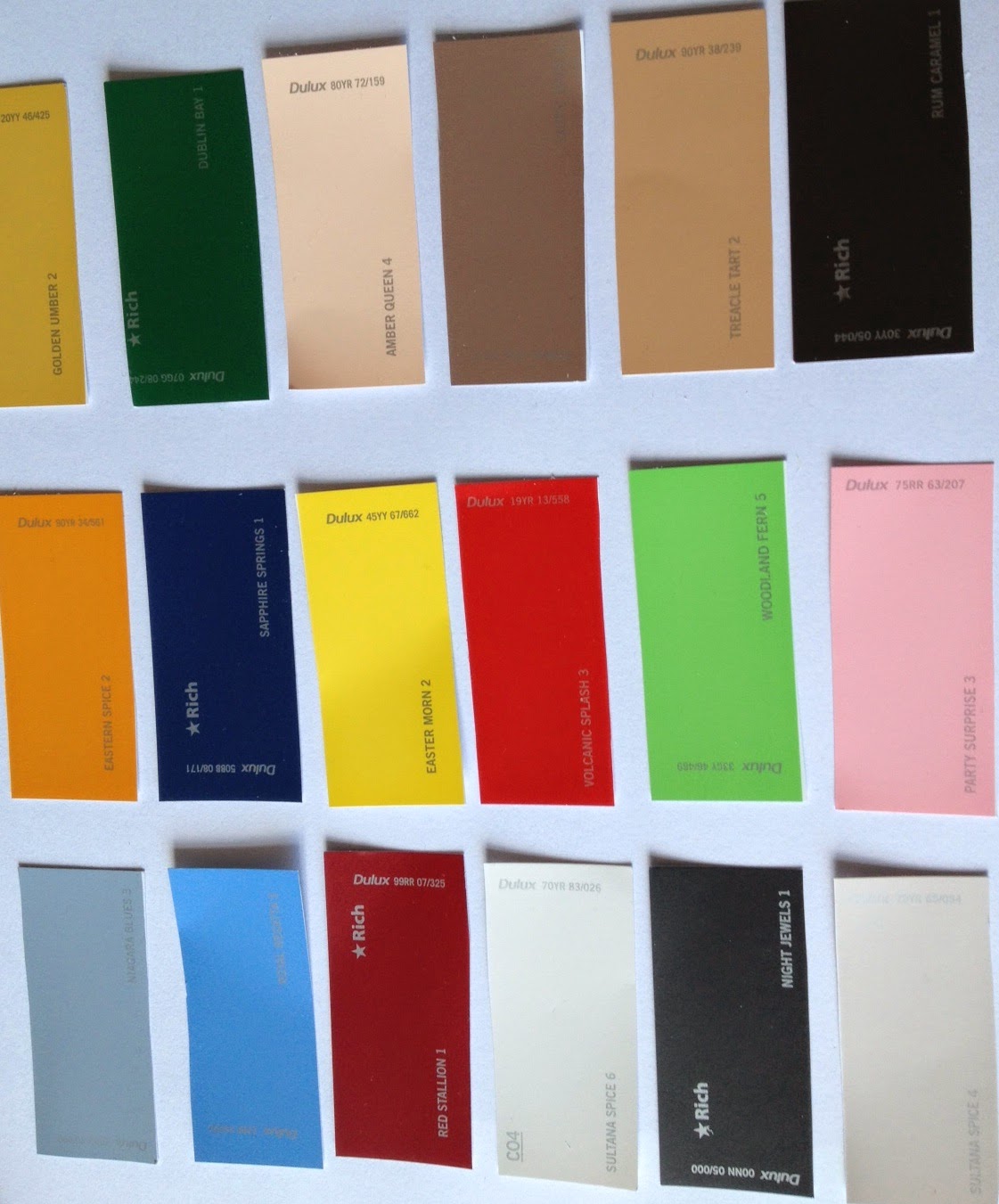
The electronic colour matching equipment used by the dyer however meant that I also needed to find textile and preferably wool samples for them to use in the ‘colour spectrometer‘ to measure which dye would be required to create each colour. My paint colour cards reflected the light differently to fibre samples and therefore couldn’t give an accurate enough reading. I somehow managed to find a textile sample to represent each of the chosen colours and sent them up to Bill.

The next step required a sample cone of the yarn also being sent to Bill and small test samples being made of each colour required. Once I received the samples back I then needed to determine if any of them needed correcting.

These corrections would only be done at the ‘live‘ stage, so I wouldn’t actually know until their return whether all the colours where exactly as required. After what seemed like an agonizing few months several huge boxes containing cones of yarn in 16 different colours arrived at my home.

Much to my relief the colours were incredible. The next continuing step is to wind the yarn off the cones and into 25g hanks and then band them with their pretty Fenella bands identifying each colour.

There is:


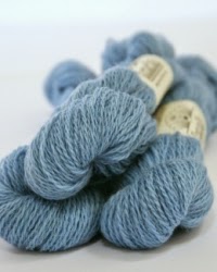


I’ll tell you more about the individual colours and how they will be used in the Vintage Shetland Project over the next few weeks, but in the meantime here is all the technical stuff you will want to know:
Each skein weighs 25 grams with approximately 124 metres (135 yards) on each skein. This wonderfully versatile yarn will knit to a wide variety of tensions so is perfect for matching up to vintage 3 ply patterns and I have suggested a standard tension of 30 to 36 sts per 10 cm (4 inches). The composition is 100% pure new British wool and is a blend of 70% Exmoor Blueface and 30% Blueface Leicester.
The yarn cost a very reasonable £4.00 per skein and can be purchased directly from my shop.
The yarn will be available to retailers and if you are interested in stocking Fenella, please contact me on wholesale@susancrawfordvintage.com
Look out later today for the launch of the first pattern in Fenella - Cresta Dell'Onda which I'll tell you more about tomorrow along with another new design just released in Pom Pom magazine.
In the meantime, I hope you love Fenella as much as I do.
for now
Ruby xx
The process of having a yarn commercially produced is a long, slow one. Each step takes many months and also requires a big commitment money-wise to have stock manufactured. Therefore I had to be very strict about how many colours I could actually have. Ultimately I chose 16 colours which cover all my needs for the garments using the yarn and also a couple extra which rounded out the range, making it look more of a collection rather than disparate colours.
After arranging with John Arbon for a 2 ply weight yarn to be spun, I then had to find myself a dyer who would produce the relatively small quantities I required at a commercially viable price. It is extremely difficult in the UK to find a ‘commercial’ dyer who will dye around 10kg of any one colour and then also ensuring that the cost is not too prohibitive. After a lot of searching I found such a dyer in the Scottish Borders. The next step was to provide Bill - the dyer - with colour samples from which he could create the colour palette for Fenella. This was the trickiest part of the whole process as the colours I required recreating where contained in the vintage garments housed at the Shetland Museum archive. Whilst in Shetland I had matched paint colour cards to the garments in order to use them on my return to England.
The electronic colour matching equipment used by the dyer however meant that I also needed to find textile and preferably wool samples for them to use in the ‘colour spectrometer‘ to measure which dye would be required to create each colour. My paint colour cards reflected the light differently to fibre samples and therefore couldn’t give an accurate enough reading. I somehow managed to find a textile sample to represent each of the chosen colours and sent them up to Bill.
The next step required a sample cone of the yarn also being sent to Bill and small test samples being made of each colour required. Once I received the samples back I then needed to determine if any of them needed correcting.
These corrections would only be done at the ‘live‘ stage, so I wouldn’t actually know until their return whether all the colours where exactly as required. After what seemed like an agonizing few months several huge boxes containing cones of yarn in 16 different colours arrived at my home.
Much to my relief the colours were incredible. The next continuing step is to wind the yarn off the cones and into 25g hanks and then band them with their pretty Fenella bands identifying each colour.
There is:
Phthalo
Columbine
Atomic Red
Baked Cherry
Limoncello
Forget-me-not
Myristica
Myrtle
Roman Plaster
Jonquil
Constance Spry
Marriner
Wheaten
Porcellana
Delicot
and finally, Chalk
I’ll tell you more about the individual colours and how they will be used in the Vintage Shetland Project over the next few weeks, but in the meantime here is all the technical stuff you will want to know:
Each skein weighs 25 grams with approximately 124 metres (135 yards) on each skein. This wonderfully versatile yarn will knit to a wide variety of tensions so is perfect for matching up to vintage 3 ply patterns and I have suggested a standard tension of 30 to 36 sts per 10 cm (4 inches). The composition is 100% pure new British wool and is a blend of 70% Exmoor Blueface and 30% Blueface Leicester.
The yarn cost a very reasonable £4.00 per skein and can be purchased directly from my shop.
The yarn will be available to retailers and if you are interested in stocking Fenella, please contact me on wholesale@susancrawfordvintage.com
Look out later today for the launch of the first pattern in Fenella - Cresta Dell'Onda which I'll tell you more about tomorrow along with another new design just released in Pom Pom magazine.
In the meantime, I hope you love Fenella as much as I do.
for now
Ruby xx
Sunday, April 27, 2014
The KNITSONIK Stranded Colourwork Sourcebook
There has been a marvellous blog tour going on over the month where Felix has answered many questions and already provided us with tantalising glimpses of what the book will be like. To sign off the tour, we had a wonderful email conversation about taking inspiration from what is all around us and naturally, our thoughts turned to my new home and how the sights that I now see every day could be turned into stranded colourwork. We are both planning to use these images to create a piece of stranded colourwork based on the images we have chosen, and later in the year, Felix and I will come back to the blog and share our creations!
So here is how our correspondence about textiles, place, wool and land went:
Felix: It's been amazing following your instagram feed and getting a sense of where you are living now. Exploring an everyday sense of place and finding ways to celebrate what is right around us is key to The KNITSONIK Stranded Colourwork Sourcebook, so it was really nice to think about what you might translate into stranded colourwork over there at Monkley Ghyll, and to look at the photos and think about some of the colours and shades in the landscape where you live.
I picked out from your instagram loads of daffodils and lambs... a very yellow, blue, green, white palette for spring!

I love how the filter you have used here emphasises the blue-ish green of the daffodil stems vs. the warmer grass green, and the little emerald spot on the lamb's fleece. Down here when Daffodils come it is a very welcome relief to the long dirge of the winter, and they really are a wonderfully buttery yellow! I could imagine playing with shading and different warm/cold greens working out of this image, and it would be interesting to play with the yellows and see how best to make them pop in the knitting like they do in this very spring time scene. I have been really enjoying exploring the greens of the Jamieson & Smith palette for The KNITSONIK Stranded Colourwork Sourcebook, and especially for the section I want to write that deals specifically with plants.
What astounds me is how differently greens behave whether beside purple - as in my sloes design - or yellow - as in my hops design!

The green and yellow parts in my knitting based around my favourite beer are to me reminiscent of the palette of your daffodils.

Susan: These particular daffodils are a very sharp, bright yellow as they appear in the photo so provide a very strong contrast to the almost flourescent grass around them. And with the darker green of the daffodil leaves as well as the grass and the holding mark on the lamb, there are at least 3 or 4 greens to play with, as well as the deepest grey/almost black depth of the shadows in the depths of the grasses and the foliage. With the natural shades of the lamb itself and the wooden post in the background you have a very classic 'Shetland' colour palette. I am amazed every morning how the colours in the landscape seem to alter and have noticed how when close up it contains a lot of quite sharp contrasts.
Felix: Yes - that selection of greens and the shadows in the depths of the foliage remind of a beautiful woven woollen blanket from the Karula Parish in Estonia, which plays with this similar palette in woven stripes.

This blanket is held in the Estonian National Museum collection, and I found it in a book produced by a wonderful group of women living in the Karula Parish in South Estonia. Several of these women - including Olivia Till and Lilian Freiburg - are married to farmers. They develop wool products from what is grown on their farms in a collective, independent organisation called "Maavillane". They produced this book exploring the historical textiles from the Parish of Karula, and - as part of their exploration of local heritage - made their own skirts in the shades of the Parish, from wool they grew. I wanted to show you this blanket, because I think the ethos of these amazing women, growing their own wool, living on the land, and exploring their textile heritage, is not far from your own.

Here are Olivia (left) and comrades, wearing outfits made from wool they have grown, in a landscape far different from the one you now live in.
Susan: I love this image. It has a 1920s/30s style to it. I have been looking at this period for inspiration for the perfect 'fashionable farming' outfit and this photograph has given me a lot of ideas!
Felix: Is this the view of your driveway? Are you going or coming home in this image? What strikes me are the found stripes in both the tyre tracks and the fence-posts along the side, and that pine tree looks like motifs I've seen in lots of Nordic knitting.

Susan: We were walking back down our driveway in this photo. Our house is the stone farmhouse with barns attached that you can see at the bottom of the drive. I wasn't even particularly conscious of the shadows caused by the fence posts when I took the photo but when I looked at it afterwards I immediately noticed them too. The walls and the gate posts all around the farm add straight lines to the undulating landscape dividing the expanse into sections that you can view separately or as part of the whole. Our pine tree is one of only two or three on the whole farm and it seems to really stand out at the bottom of the drive. Despite the driving winds that hit it, it has managed to achieve a remarkable amount of symmetry which is probably why its so reminiscent of the knitted tree motifs.
Felix: Yes, the tree is very upright and symmetrical. The combination of stripes, the striking tree, and the fresh greens really put me in mind of this ski-ing jacket from a Latvian knitting book I own, published in the 1950s. It could be wonderful to do something with the warm greys of your driveway intersecting with those bright shades and the pleasing geometry of the pines.

Susan: As you might imagine, I love this with all my heart! I have a number of images very similar to this one in vintage Norwegian books in my library. Another potential direction!


Felix: It feels like you've used a blue filter in the image below, but even so, it's amazing how the weather and the light change the colours of the view. Lilac and purple and russet in the one above and aqua and chocolate and blue in the one below.
Susan: It's interesting that you've picked out these two images. They show slightly different angles and at different distances of the vista across the Forest of Bowland - our farm is at the northern edge of the Forest (not actually a forest but a geographical area) and we look back at these hills in the Forest. The first image is one that I look at every day and the colours change every day but the hill in the distance - Clougha Pike - always has this purple, pink and lilac cast to it, except on very very grey cold days like the image below. The pike itself is to the right and out of shot at this angle, but it was taken early in the morning after a ground frost and the low lying clouds teamed with the white frost on the ground created a very unusual light. It was still quite dark so I have lifted the image so that the detail can be seen but most of it is due to the crazy light conditions.
It is suddenly such a different colour palette to the image above. I look at the pike every day to observe its changing moods!
Felix: In terms of translating these different views into stranded colourwork, I am reminded of stripes, and of a brilliant blog post on the Faroestrands blog that I saw on the idea of STRATA and with those Cyan blues and brown lilac shades in the bottom image, I think of Patty Knox's 1980s classic, "New Directions in Fair Isle knitting" and especially the Waves V neck pullover which stacks up strata or repeated lines and shades in a similar but far more limited palette.

Significant challenges when translating the landscape into stranded colourwork include dealing with the sense of distance, and the variety of textures. Knitting is a flat plane, where your huge and glorious vistas of mountains go back for miles, and knitting has a uniform textural surface. Even if you vary the types of stitches that you use, and the types of yarn involved, it's very difficult to emulate the way different surfaces in the landscape reflect the light. Often the contrasts in the landscape are produced by differences in texture and how light is reflected rather than in shades alone, and I love working out how to compensate for that in stranded colourwork. I was thinking a lot about this when working with my favourite old pair of socks, and the combination of the variegated yarns I used to knit them, and the landscape around Portland, near where Mark grew up. How do you create that sense of distance through shading? In this photo you can see my swatch, and the old, much-darned socks originally knitted in Lorna's Laces, Seashore colourway.

This is Portland. You can see how distance and the same sense of a view as in your photos have influenced the order of blues and other hues in my swatch.

Your landscape photos really make me think about transitions between shades, and how on earth to suggest the fade from distant hill to wandering stone wall, to matt green fields, to a dusting of snow...
In a totally different image, much less vista-ish and more close up, the red is so fresh and vibrant here on the chickens' combs against the bright greens and yellows of spring!

Susan: I couldn't quite believe this photo when I looked at it. The contrasts are all so sharp and clean and primary. The chickens have kindly been in prime condition since moving to the farm and are looking in gleaming good health and their combs reflect that. This would make quite a bold colour palette as each colour is so strong in its own right and yet as shown with this photo - it works! This photo also made me decide to only have black or white chickens as I love how they contrast to nature around them :)
Felix: It is so fresh and bright, and if you squint your eyes, there is a really nice sense of rhythm in this image, from the regular "beats" of the fence posts in the background, to the pops and bangs of the yellows and reds. The green is again very dominant, but in terms of thinking how I might take those vibrant colours and knit something representative of how they show up here, I want to show you this Latvian image from my 1950s book. A design like this which involves four colours per round on every third round would produce I think a fabric which would be quite bulky. Good for mitts to be worn in very cold climates, perhaps, but probably outside of the scope of The KNITSONIK Stranded Colourwork Sourcebook! Still, it's very nice to see how shades are organised into patterns here, reminiscent of your chickens in the daffs, with their bright red combs.

I also wanted to share how a palette very like your lovely instagram picture was used for a yoke in a 1970s knitting book I have called "Aran and Fair Isle Knitting". I think the similarities in shades are similar, though proportionally your chickens introduce far more white than there is in the yoke, here. Following what you say about black or white chickens, it would be amazing to see what would happen if the proportions in this design were stretched to accommodate how much white there is in your original photo, and/or swapped out for black to represent the high contrast chicken palette you imagine around your farm in the years to come!


And I love this slightly busted looking fence for its prosaic qualities, for the challenge it presents to the stranded colourwork knitter! How to wrest something pretty and delicate from a worn bit of fencing, but - look closer - there is a windowpane pattern in that wire, studying the barbed wires may even yet yield something interesting, and even the arrangement of the timber suggest an exciting geometric form that could be amplified across the surface of your knitting!

Susan: I have always photographed broken, damaged, tumbling down, decaying things. I find them particularly beautiful but I agree completely that they are more of a challenge to find an obvious design within them as they have often lost their symmetry and can at first glance appear quite 'ugly'. I would love to see what you would make of this one. As you say, there are a whole number of aspects you could isolate and use in a design. Funnily enough on the surface the shape of the gate and the wire pattern within suggest a section of a lace repeat to me so it is more of a challenge to me too to see it as stranded knitting so this is the one that I think I really need your help with!
One of my favourite books picked up during my Estonian travels was written by the amazing craftswoman and artist, Tuuli Tubin. It documents mittens from Võromaa, Tuuli's home county. The book features lovely images of old mittens, interspersed with photos of the county in Winter. Like what we are doing here, it links place, landscape, textiles and heritage together, and reading through it creates lovely suggestions and connections between ideas.
Perhaps my favourite pairing in the book is a double spread which features a very graphic red and black mitten on the left hand side, and then a delicate print of some kind of plant umbel dried and dead and pressed in the deep snow. For me this pairing is genius - like your broken fence with its trailing wires, it makes links between the lines we find around us and the lines we plan when we design.


Felix: I have really enjoyed sharing some of my textile books and ideas about stranded colourwork with you here - I hope you and your readers have enjoyed it, too! I am not sure yet whether I will work with ALL of the ideas from this post for my giant Monkley Ghyll swatch, or just several, what about you? It will be nice to see what we both come up with in November when The KNITSONIK Stranded Colourwork Sourcebook comes out, and it's beautiful to be ending this blog tour with the prospect of some future knitting to come.
Susan: Its been a delight to share these images and ideas with you and I’m very, very excited to start on some colourwork ideas that are forming out of our conversation. I have particularly enjoyed how you have used so many books to inform your creative ideas, which is exactly how I approach the design process myself and as many of my books are still packed away in boxes it has been wonderful to dip into your library and get inspiration from them and from you. I for one, can’t wait for November when your book comes out and we all get the chance to share your creative processes with you. Thank you so much for stopping by the blog.
Felix: Thanks for having me x
You can find out more about Felix's work on her website and don’t forget you can contribute to Felix’s Kickstarter campaign and be sure of your copy of this truly inspirational book until the end of the day.
for now,
Ruby xx
Subscribe to:
Posts
(
Atom
)